VyreportujTo — web
The marketing site of my own SaaS — instead of promises, it lets you straight into the app.
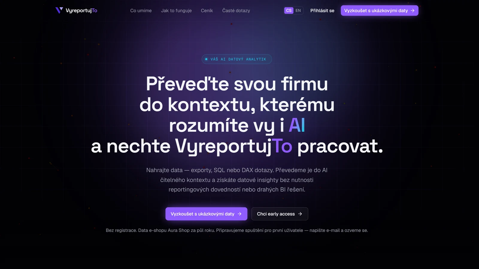
The public site of my SaaS at vyreportujto.cz. Its job is to explain in a few seconds what the product does and then prove it: a "Try it with sample data" button drops the visitor into the real app with ready-made dashboards and analyses — no e-mail, no sign-up. The second path is a waitlist for early access with your own data.
The site and the app are one Next.js project — shared components, sign-in and brand. The public pages are deliberately louder, though: a deeper dark palette, glass, neon accents and motion. The app behind the sign-in keeps a calm rhythm, because there speed of work matters more than effect.
What I did
- A one-click demo: the account is created server-side, with sample data in Czech and English
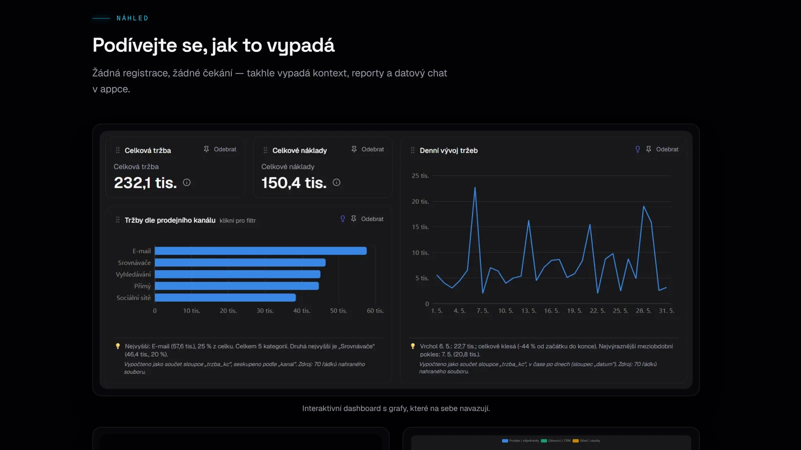
- App previews right on the site — the dashboard, the data chat and the source map
- A waitlist with bot protection (honeypot) and its own API
- Czech and English versions with translated URLs, hreflang and a sitemap
What it runs on
Next.js 16 and React 19
The App Router with server components — copy and content arrive ready in the HTML, and JavaScript is shipped only for the interactive parts. The same project also serves the app and its API.
Tailwind 4 and shadcn/ui
Colours, glass and typography are tokens in one place. The public site has its own palette that wins over the app's in the cascade, so the two never break each other. Components sit on Radix for accessibility.
next-intl
Czech and English including translated URLs — /cenik and /pricing, /jak-to-funguje and /how-it-works. Every page carries its canonical URL and a link to the other language.
Supabase and Vercel
The waitlist and demo accounts live in Supabase; the demo account is created by the admin API on the server, so the visitor fills in nothing. Hosting and analytics on Vercel, deployed automatically from git.
How the site guides a visitor
- 01
The intro and two paths
One sentence on what the product does and two buttons: try it now on sample data, or sign up for early access.
- 02
App preview
The list of screens on the left works as a switcher — a click swaps the screenshot on the right with a crossfade. The box has a fixed aspect ratio, so the layout never jumps.
- 03
What it does and how
Six features in cards and three steps from data to result. The steps advance on their own every 4.5 seconds with a progress bar; a click locks a step.
- 04
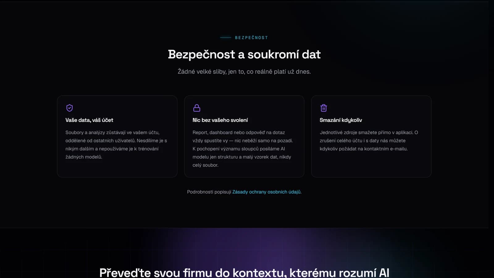
Security and privacy
A section of its own with three concrete promises, because companies ask about their data first. It states only what is true today.
Effects and interactions
Every effect has a fallback for weaker devices and for people who switched animations off in their system.
A particle network in the hero
A custom 2D canvas instead of Three.js — it saves hundreds of kB. The particle count follows the screen area, and the loop stops off-screen and on a hidden tab.
3D card tilt
Cards tilt after the cursor with a glare. It runs on motion values, so hovering triggers not a single rerender. It stays off on touch screens.
Scroll reveals
Sections slide in with the motion library through a set of shared wrappers. Hover effects are plain CSS — cheaper and just as smooth.
Smooth scrolling and glass
Lenis for smooth scrolling on desktop, glass cards with a blurred backdrop, gradient glows in the background and headings in Space Grotesk.
A closer look
A demo without sign-up
Visitors see a real dashboard, with an explanation under every chart, before they'd have to give an e-mail address.
Security and data privacy
Three concrete promises instead of vague phrases: the data belongs to the account, nothing is sent without consent, and everything can be deleted at any time.